Positions Through Iterating
11.04.2023 - 28.04.2023
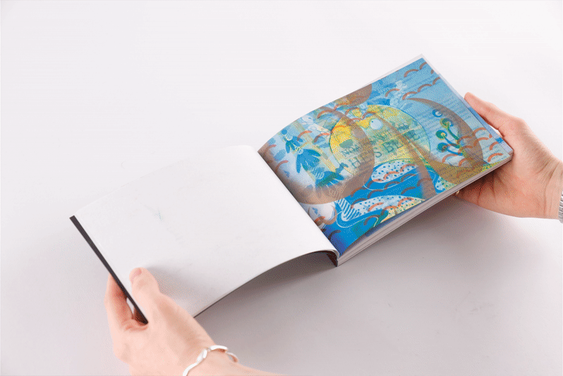
Studio Work

Lines of Enquiry
Topics:
Gleaning: and how it can be used to create new meanings from discarded content, with and without the intentions of the original creator.
Gibberish: as non legibility, non-linearity, and as semantic satiation. Circular systems where inputs become outputs. Overload of information in a digital environment (particularly inspired by the massive datasets feeding AI).
Methods:
1. Creating a publication using gibberish as a method to explore ways in which AI generated images are created and received.
2. Creating a nonlinear publication, which can be read in different ways to create different meanings, or no understandable meaning at all.
Cataloguing & translating.
Mediums:
Gibberish text. Layered Risogaph printing. Hand made publications.
Questions:
- How can gibberish take different forms within design work?
- How does text lose its meaning?
- How can using a traditional graphic form like a publication help us engage with and understand gibberish in the modern world?
- Is there something about a traditional, 'old-fashioned' medium that makes gibberish seem more out of place? Or do works like Jabberwocky show a history of literary gibberish?
- Is there a way to represent the over-saturation of information we find online in a physical way?
Bibliography
The Gleaners and I (Varda, 2000) is one of the most charming films I’ve ever watched, with Varda’s clear love for people shining through almost constantly. The way Varda presents such a range of people and situations that involve gleaning has helped me think about how I could continue with this topic later down the line.
There is a clear link between the gleaners shown in the film and the work I’ve already been doing, picking out snippets of discarded work, left behind to rot in the Publications Workshop.
It helped me to recenter this project, as after Unit 1 was finished I thought I’d be exploring appropriation, but instead what I was more interested in is the gleaning of art.
The fact that the entire film became Varda’s own way of gleaning perfectly showcases the sort of process-driven, integrated design work I’d like to undertake, and have been trying to in this project.
The camera becoming such a visible part of the story is beautiful and related to my project too, as I am trying to make printing & publishing (with Riso in particular) a visible part of the outcomes. In particular there’s one scene where Varda includes a clip of the camera facing down, accidentally recording the lens cap dancing around, which helped remind me to keep my experiments a little playful and to not always take them seriously.
Weekend (Godard, 1967) is a postmodern, non-linear film with clear overarching satire of bourgeois capitalist culture. Presented in an ambiguous way, Godard leaves an element of interpretation up to the viewer; and for me an element of confusion. This confusion helped me to consider how gibberish can exist beyond simply writing out letters into words that mean nothing, and through this, Weekend became a key resource for changing the way my project thought of ‘gibberish’ in two key ways: semantic satiation and non-linearity/confused timelines.
Semantic satiation is the term for when a word or phrase is repeated until it seems to lose meaning (Das, 2014), and a key visual element of Weekend is the large, screen-filling captions and titles that flash in and out, repeating and morphing. This is something that I chose to incorporate in my second publication, with the idea that I could repeat a short phrase until it lost almost all meaning.
In terms of nonlinearity, Weekend’s timeline is arranged seemingly at random, disregarding traditional narrative structure to present events in a dynamic, rapidly changing way, which contrasts the extreme long shots shown for much of the film. This inspired my decision to focus on the way manipulating chronology and arrangement can both add intrigue to a narrative, as well as add confusion.
Jabberwocky (Carroll et al., 2013) is probably the defining piece of nonsense literature and I don’t think I could do a project around this topic without reading and referencing it. As a short narrative poem it directly inspired my decision to play with gibberish text for my iterations—instead of leaning in towards the boundary of legibility when it comes to not understanding—as I found it fascinating how Carroll is able to tell an understandable hero’s journey and perfectly balance gibberish with real words, syntax and context, which is something I’d like to do in the project.
I ended up moving a bit away from nonsense words when it came to my outcomes, instead focusing more on non-linearity, but Jabberwocky provided a base for a lot of this exploration.
It’s particularly interesting to read with a modern eye, as most of the words are still complete nonsense, but there are several (like 'galumph' and 'chortle') which have become part of regular English. This has helped me to consider how my work that could originally be perceived as gibberish could later develop and have a newer meaning attached.
Multimodal datasets: misogyny, pornography, and malignant stereotypes (Birhane, Uday Prabhu, & Kahembwe, 2021) is a research paper exploring and analysing how the current ways of filtering inputs used for AI training are allowing pornographic, racist, and misogynistic content to feed outcomes from AI.
The section of particular interest to my project is when it talks about CLIP (which is an AI software trained to create text captions for images) and looks at how biases in the captioning software can accentuate biases in image generation.
This ouroboros of inputs affecting outputs, which then become the new inputs is something I became interested in and related to my current project. The project involved taking things people had printed and reprinting them in different capacities, and helped me to critically consider the negative impact that my ‘stealing’ of other people's work could have - both in terms of unpredictability of outcome and of emotional distress that could potentially be caused.
My work has been very selective so far so it was interesting to see the issues and ethical concerns that come up when looking at this sort of topic on scale with limited filtration, and made me consider how my project fits within a wider context.
In Defence of the Poor Image (Steyerl, 2012) is an essay arguing that wide distribution of an image is often more important than the resolution.
And although the essay is specifically about digital images, I think there are similarities to my project. Specifically, I think the quote “The poor image is an illicit fifth-generation bastard of an original image. Its genealogy is dubious” is a good one to consider my project with. In the way that Twitter users don’t always seek attribution when they click retweet, I wasn’t aiming to find out who created the work I was using, instead I wanted to use the work to frame my investigation and ground my project within the printing process; and this text helped me centre my position as an arranger of existing prints, rather than a historian.
In a way I found myself giving discarded prints (and soon to be discarded masters) one last appearance, without caring too much about resolution or quality or even content.
Spotify Wrapped 2021 (Spotify, 2021) was controversial among many, with some going as far as calling it a “design nightmare” (Bamsey, 2021), and while I personally think it looked good, it represents a wider issue that projects and designs that are well liked within design circles don’t always translate to a general audience. The phrase ‘digital brutalism’ was in use for at least 4 years before Spotify Wrapped 2021 (Hill, 2017), but had still not fully entered mainstream design in 2021, leaving it as a shock to many to see text manipulated to the point of illegibility.
This specifically helped me to consider who my target of this project is, and realise that by focusing on design work for designers I might lose the connection to a general audience. For this project I’m happy to do that, and to focus on producing outcomes specifically for other designers but I think that in the future I’d love to explore how the public would react to my exploration.
Varda, A. (2000) The Gleaners and I. Paris: Ciné Tamaris.
Godard, J.-L. (1967) Weekend. France.
Carroll, L. and Beer, G. (2013) “Jabberwocky,” in Jabberwocky and other nonsense: Collected poems. London: Penguin Books.
Birhane, A., Uday Prabhu, V. and Kahembwe, E. (2021) Multimodal datasets: misogyny, pornography, and malignant stereotypes. arXiv preprint arXiv:2110.01963.
Steyerl, H. (2012) “In Defence of the Poor Image” in The Wretched of the Screen. Berlin: Sternberg Press.
Spotify (2021) “Spotify Wrapped.”
Bamsey, A. (2021) Spotify wrapped is a design nightmare, Creative Bloq. Creative Bloq. Available at: https://www.creativebloq.com/news/spotify-wrapped-font (Accessed: April 24, 2023).
Hill, J. (2017) Why you should care about digital brutalism, Medium. UX Collective. Available at: https://uxdesign.cc/why-you-should-care-about-digital-brutalism-fa0c82d60133 (Accessed: April 24, 2023).